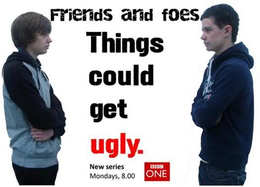
Above, is a draft of my billboard. I have made a draft so that I can see where I need to improve when I create my final billboard poster.
Aspects to improve:
• The name of the soap – ‘Friends and foes’ needs to be more prominant on the page, and stand out. At the moment, it is fairly small. I could improve this by moving the tag line, ‘Things could get ugly’ to the top of the page, and move the soap name to the middle, and make the font larger.
• The institution branding – BBC one, needs to be bigger. At the moment, it is very small. This is important because this is a roadside billboard, and someone driving past might not be able to see what channel the soap is on, and what time it is on, as this information is very small, at the bottom of the poster.
• The fonts and color scheme need to fit in with the institution – BBC one. At the moment, the fonts are not similar to the fonts that BBC one use. Also, i need to incorporate BBC one’s main color – red. This is because this would help the reader to recognise that the soap is on BBC one. I could do this by making the background red, and making the BBC one logo bigger and more prominent on the page.
No comments:
Post a Comment