Monday, 20 December 2010

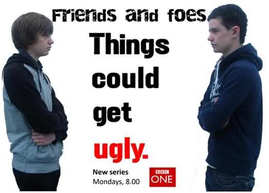
FINAL PRODUCT: BILLBOARD POSTER:

Photobucket

Link to billboard poster:
http://i1095.photobucket.com/albums/i461/Adam14193/FINISHEDBILLBOARD.jpg

Thursday, 16 December 2010

FINAL PRODUCT: TV LISTINGS MAGAZINE FRONT COVER:

Photobucket

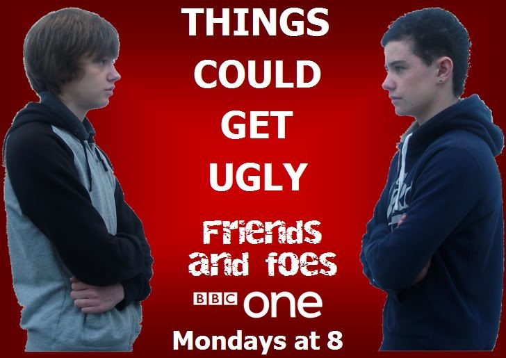
DRAFT BILLBOARD:

Photobucket

Above, is a draft of my billboard. I have made a draft so that I can see where I need to improve when I create my final billboard poster.

Aspects to improve:

• The name of the soap – ‘Friends and foes’ needs to be more prominant on the page, and stand out. At the moment, it is fairly small. I could improve this by moving the tag line, ‘Things could get ugly’ to the top of the page, and move the soap name to the middle, and make the font larger.

• The institution branding – BBC one, needs to be bigger. At the moment, it is very small. This is important because this is a roadside billboard, and someone driving past might not be able to see what channel the soap is on, and what time it is on, as this information is very small, at the bottom of the poster.

• The fonts and color scheme need to fit in with the institution – BBC one. At the moment, the fonts are not similar to the fonts that BBC one use. Also, i need to incorporate BBC one’s main color – red. This is because this would help the reader to recognise that the soap is on BBC one. I could do this by making the background red, and making the BBC one logo bigger and more prominent on the page.

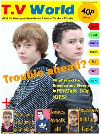
DRAFT TV LISTINGS MAGAZINE FRONT COVER:

Photobucket

Above, is a draft of my T.V listings magazine front cover. I have made a draft so that I can see where I need to improve when I create my final front cover.

Aspects to improve:

• Day tabs on the right hand side need to go all the way down the page, as this is conventional.

• More photo features needed.

• The primary feature photo takes up a lot of the page, due to it being of 2 people. In the final front cover, the main photo could be of one person, in medium close up. This would leave more room for features.

• Primary feature – ‘Trouble ahead’ needs to be lower down the page, because at the moment, it seems too near to the masthead.

• There needs to be a clear colour scheme.

• The front cover needs to have a narrative, and somewhat tell a story. At the moment, the features seem somewhat unrelated.

FINAL PRODUCT PLANNING - Planning Documents - Analysis of 2 billboard posters:


Above, is a PowerPoint presentation, containing evaluations of 2 billboard posters. One is a billboard for the soap 'Neighbours' and the other is a billboard. For the T.V drama 'Doctor Who'. Although 'Doctor Who' is a T.V drama, and not a soap, it was interesting to look at whether or not the conventions changed, when comparing the 2 billboards.

FINAL PRODUCT PLANNING - Planning Documents - Analysis of 4 T.V Listings Magazine Front Covers:


Above, is a PowerPoint presentation, containing evaluations of 4 existing T.V listings magazine front covers. 2 of them are general T.V magazine front covers, and 2 are soap-specific front covers. From doing this, I have found that soap-specific magazine front covers contain more pictures and features in general. I have found that general TV magazines usually contain less features, and the main feature photo is usually of one person, in medium close up.

Wednesday, 15 December 2010

FINAL PRODUCT PLANNING - Planning Documents - Soap Trailer:


Above, is a PowerPoint presentation, which contains planning for shooting our soap trailers. It includes scripting, roles within group, costume and prop preperation, and location.

Monday, 13 December 2010

FINAL PRODUCT PLANNING - Research - Institution, Audience, Issues and Debates:


Research:

Institutional research - Which station should broadcast your soap, and why?

I believe that a Television station such as BBC One could broadcast our soap, this is because BBC One already broadcasts many soaps, such as EastEnders and Waterloo Road. This means that BBC One already has an audience for soaps. Also, because our soap contains a fairly young task, there is already somewhat of an audience for a soap like this, because Waterloo Road also contains a fairly young cast.

Audience research:

The audience of my soap can be linked with the institution(s) that I believe could broadcast my soap. This is because, if a soap contains a predominantly young cast, young people are likely to watch it. For example, in my soap trailer, the cast will be aged between 17 and 18, meaning that, in my opinion, the audience for my soap will be 15 – 25 year olds, because it will explore the issues that they face.

Issues and debates:

Catharsis needs to be explored when looking at the issues and debates of a soap. Catharsis means when someone watches certain situations in a soap, and empathising with them, because you are going through the same situation. This makes the viewer feel better. This can be linked to audience, because if a young person watches a character of a similar age, in a soap, going through a situation that they are going through, catharsis may occur because the viewer can empathise with what the character is going through. I will try and achieve this catharsis in my soap trailer.
Thursday, 9 December 2010

FINAL PRODUCT PLANNING - Existing Trailer 3 - Neighbours Trailer:


Above, is a trailer from the soap, 'Neighbours'.


I have looked at this trailer during planning, because it contains certain conventions of soap trailers that I would like to achieve in my soap trailer, such as:

The use of text - I would like to include title cards in my final trailer, in order to make the narrative easier to understand, and to help create tension.

About Me

A2 Media Studies Coursework.