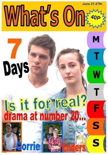
Above, is my first attempt at a TV listings magazine front cover.
Conventions:
I believe that I used the conventions well. There is a main feature, with a photo in medium close up, as well as secondary features. The date of the magazine is clear, and I have included the price, in a button. The masthead is large and bold.
Improvements to be made:
More features are needed, as existing products usually inlcude more than 2 secondary features.
Brand needs looking at - The masthead and brand do not really stand out on the page, so I need to consider branding, when creating my final front cover.
The main photo is somewhat faint, so therefore, it does not show enough realism, compared to existing products. To improve this, I could have taken the photo in a slightly darker setting, rather than in a very light location.

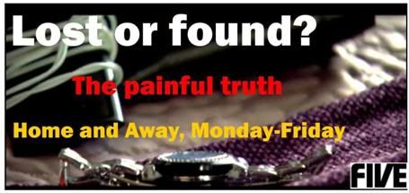
Above, is a mock up of a billboard, using the existing soap name 'Home and Away'. I created this by looking at existing soap billboards, and then making a mock up billboard, using a still image from a soap.
No comments:
Post a Comment