Adam Martin - A2 Media Studies Coursework:
Friday, 8 April 2011
Monday, 20 December 2010
Thursday, 16 December 2010
DRAFT BILLBOARD:

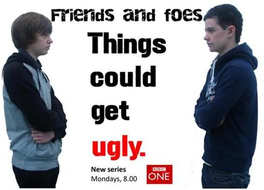
Above, is a draft of my billboard. I have made a draft so that I can see where I need to improve when I create my final billboard poster.
Aspects to improve:
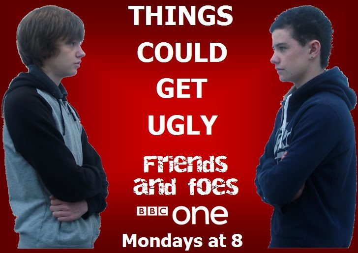
• The name of the soap – ‘Friends and foes’ needs to be more prominant on the page, and stand out. At the moment, it is fairly small. I could improve this by moving the tag line, ‘Things could get ugly’ to the top of the page, and move the soap name to the middle, and make the font larger.
• The institution branding – BBC one, needs to be bigger. At the moment, it is very small. This is important because this is a roadside billboard, and someone driving past might not be able to see what channel the soap is on, and what time it is on, as this information is very small, at the bottom of the poster.
• The fonts and color scheme need to fit in with the institution – BBC one. At the moment, the fonts are not similar to the fonts that BBC one use. Also, i need to incorporate BBC one’s main color – red. This is because this would help the reader to recognise that the soap is on BBC one. I could do this by making the background red, and making the BBC one logo bigger and more prominent on the page.
DRAFT TV LISTINGS MAGAZINE FRONT COVER:

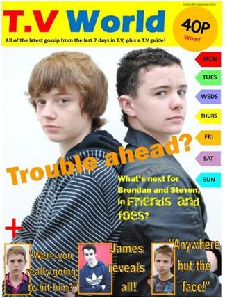
Above, is a draft of my T.V listings magazine front cover. I have made a draft so that I can see where I need to improve when I create my final front cover.
Aspects to improve:
• Day tabs on the right hand side need to go all the way down the page, as this is conventional.
• More photo features needed.
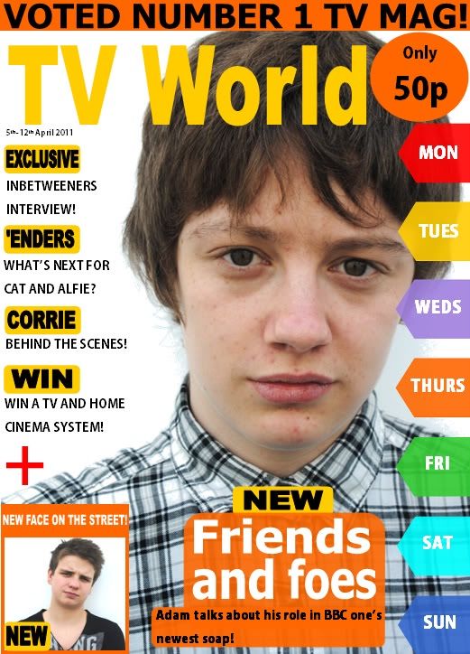
• The primary feature photo takes up a lot of the page, due to it being of 2 people. In the final front cover, the main photo could be of one person, in medium close up. This would leave more room for features.
• Primary feature – ‘Trouble ahead’ needs to be lower down the page, because at the moment, it seems too near to the masthead.
• There needs to be a clear colour scheme.
• The front cover needs to have a narrative, and somewhat tell a story. At the moment, the features seem somewhat unrelated.
FINAL PRODUCT PLANNING - Planning Documents - Analysis of 2 billboard posters:
Above, is a PowerPoint presentation, containing evaluations of 2 billboard posters. One is a billboard for the soap 'Neighbours' and the other is a billboard. For the T.V drama 'Doctor Who'. Although 'Doctor Who' is a T.V drama, and not a soap, it was interesting to look at whether or not the conventions changed, when comparing the 2 billboards.
Subscribe to:
Comments (Atom)
About Me
- Adam Martin
- A2 Media Studies Coursework.

